
Hull Ice Arena has no logo at the moment. This is the only sign that Hull Ice Arena has –
This means that logo has to be created for this project.
Next task is to design Hull Ice Arena logo.
Hull Ice Arena has no logo at the moment. This is the only sign that Hull Ice Arena has –
This means that logo has to be created for this project.
Next task is to design Hull Ice Arena logo.
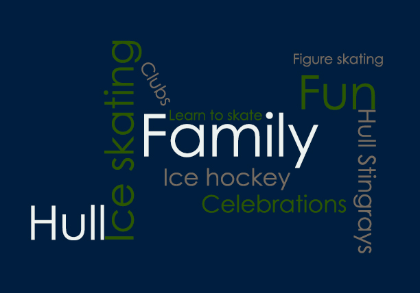
Target audience
Google Analytics tool is going to be used to monitor target audience.
Designed in Adobe Photoshop CS6.
(All pictures were downloaded from Google!!!)

Designed in Adobe Photoshop CS6.
(All pictures were downloaded from Google!!!)

This is colour palette for this project –

The reasons
Looking at colour wheel and choosing analogous colours which means 4 colours next to each other – in this case it was blue colours and green.

Blue colours were chosen because of symbolism of ice.
Theory of blue colour
(To read more about theory of blue colour, please click here)
Choosing right shades of colours
Keeping in mind that Ice Arena is a family place, picture of family enjoying ice skating was downloaded from Google and Adobe Color CC software was used to create colors from the image.

White and gray colours are chosen to make a nice contrast with other colours.
Persona template was used to create persona for this project – downloaded from FakeCrow.com
Software used: Adobe Illustrator CS6
This is what it looks like before customizing –

Persona 1 –

Persona 2 –

Both photos used for persona were downloaded from Google!!!
In this analysis, websites are going to be analyzed in four categories – Design, Navigation/Usability, Content, Cross platform compatibility.
http://www.hartwallarena.fi/en

Design
Design of this website is up to date with design trends. This is because there are ‘eye catchy’ elements such as large slideshow of upcoming events, buy now option etc. Colour scheme works really well together, main colours are blue and different shades of blue. This matches the logo of arena.
Usability/Navigation
Usability of this website is great and simple! Users know where they are on the site all the time. Users can also choose website to be in three different languages – Finish, English and Russian. This means that target audience for this website are people from abroad as well as Finish people.
There are several navigations on the website – the main navigation that includes drop down option (not suitable for mobile/tablet users!) allows users to choose what type of information they want to get – visitors, companies or event organizers.


Then it is second main navigation that allows users to find what they need such us upcoming events, food and drinks, arena servicer and directions/maps.

Upcoming events navigation is just great on this website. It is designed so well and straight forward that users of every technical ability will have no problem to use it.

There is clear explanation of when and what program is on in the calendar, users can even filter events by types in the right panel or view all events.
Another great thing is that the main navigation stays on the top of the page all the time so users do not have to scroll back up to use main navigation.
Content
Content is well written and tells users everything they need to know. It is not a lot of it and there is clear balance between images and text.
Cross platform compatibility
Mobile friendly – Yes
Tablet friendly – Yes
Responsive – Yes
http://www.centericearena.com/index.html

Design
Design of this website is nothing special but it works in all aspects. Slideshow on top of the website is there to tell users why they should come and join this arena. Slogans are short but powerful combined with images.


Colour scheme matches logo of the arena – white, blue, yellow, red. Interesting about the design is ‘cut ice’ effect around main body area –

Usability/Navigation
Usability of the website is okay. Users know where they are all the time, layout is simple but effective, and whole website is simply to use. There is only one navigation on the top of the page, which is simple and straight forward.
Disadvantages are:

Content
Content of this website is well written and clearly explained. Users find everything they need to know, plus print option to print out events.
Cross platform compatibility
Mobile friendly – No
Tablet friendly – No
Responsive – No

http://www.yorkshireswinterwonderland.com/
Design
This website is designed fantastically! It is info graphical website, static images in background that disappear after scrolling down. Gallery is very nicely presented with lightbox effect. Video background with music showing funfair is well created with booking option.

All these elements make this website up to date with design trends.
Navigation/Usability
Usability is very good. This website catches users attention straight away and offers great user experience through video/music background, shopping, showing pictures of people skating having fun etc. Navigation is simple and straight forward. There is two navigations –

Connection to social media is right on the top of the website next to main navigation so users cannot miss it. Also, Facebook, TripAdvosor and Tweeter latest posts/comments are shown before footer starts – connection to social media.
Disadvantages:
Content
Content of this website is well written and clearly explained to users – ability to find everything they need to know. There is not too much text to read, website is focused more on images.
Cross platform compatibility
Mobile friendly – Yes
Tablet friendly – Yes
Responsive – Yes
 Veronika Lesnakova