Analysis of existing gallery sites – part 2

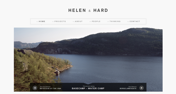
This website is different than the previous one I was analysing. It is a website about architecture called Hellen & Hard.

gallery


When you first look at it, it is nothing special, nice elegant and professional looking website. However, when pictures start to move (or you move it with your mouse), it grabs your attention because pictures move up and disappears and it looks like you look through photos in a real life. I think it is very interesting! Colour scheme is very simple and professional – grey and black.

Navigation of the site is very simple and easy to use. There is only one main navigation under the header and it always tells you where you are on the site (which is needed for users to easily orientate on the site). However, when you click on ‘People’, there is sub-navigation. You can choose between five different professions and it will highlight pictures of employees (I think it is very clever and I like it a lot, it makes it easier for users to find out professions of employees). Another sub-navigation is in ‘Project’ section, where you can choose what projects you would like to see and it takes you to gallery. Overall, navigation is simply to use on this site all the way through.

After selecting what project you would like to have a look at, there is a presentation of the images with all information you need to know underneath it. Images in presentation move themselves however, you can move them with the cursor. Content is relevant and well structured on this site. If you cannot find some information, you can contact the company straight from the site.

I think this website is dynamic because there is a contact form. This website is working in Opera 9, Chrome, Internet Explorer 9, laptop, PC and mobile but it is not a responsive.
Analysis of existing gallery sites – part 1

My task is to research and analyse two existing gallery sites.
I typed into Google ‘gallery websites’ and it started to come up with websites of galleries but they were real galleries not what I needed. So I changed it into ‘gallery website inspirations’ and it came up with quite a lot of interesting websites. I opened link www.thebestdesigns.com and the site that grabbed my attention straight away was this one – www.stockbridgeyachts.com

jachty
It is yacht website where you can buy/rent yachts. I was very impressed with the design and excellent user experience that this website gives you.

As soon as you open the site, your attention is grabbed by presentation of beautiful images of yachts on the sea. All colours were chosen carefully so it fits into colour scheme and creates a nice professional effect.

Navigation is simple and straight forward so users can easily orientate on the site. There are three types of navigation; one is on the top right under the header and it’s scroll down navigation. Second one is in the middle of the site (little circle) which helps users to go straight into browsing yachts. The last one is the biggest one on the bottom.

After selecting option of browsing yachts,  the site takes you to gallery of yachts where you can set up your requirements or choose yacht that you like and it takes you to the main gallery with beautiful images of selected yacht and information that you need.

Usability of the site is great, the design is responsive so it is a big advantage these days as more and more people use different devices for internet. Content of the site is great and tells you everything you need to know and if there’s missing something, you can contact the company straight from the website.

This website is working in Opera 9, Chrome, Internet Explorer 9, laptop, PC and mobile. I think this website is dynamic as there is a contact form for contacting the company straight from the website. What I know for sure is that this site was built by HTML5 and CSS3.