Evaluation

Overall, I really enjoyed working with our group. We proved that we are great team together where each one has very valuable skills and when we all get together, we come up with great things.

Working on this project was very interesting and it was also fun. We didn’t have problem with time management and every task was done on time. I am very happy with the result.

Designing process of poster

For this task, everyone has to design something. To design the poster was mine and Nicky’s task however, we collaborate as a group and everyone add suggestions to it. This poster was designed in Adobe Photoshop CS6 but also Adobe Illustrator CS6 was used as well.

First, we draw a quick sketch up of how poster will look like. Then opened Photoshop and started to design.

This is what we came up with (first draft) –

Working screen Adobe Photoshop CS6

working screen

poster

Explanation of the design

On the bottom, you can see outline of famous buildings in Hull. That was designed by Tom.

Mask that Tom designed –

city-mask

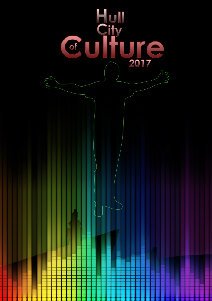
Rainbow colour is used because of the message we want to give out. It also represents laser lights as it was our initial idea that we wanted to create but it was too complicated and cause of lack of time, we didn’t do it. I downloaded equalizer picture from google (click here to view) and by mask created this effect. Outline of the man was downloaded from google ‘silhouette of people’ [to view click here] and added to the poster. He symbolizes all people from Hull.
Header is created with very good hierarchy so it grabs attention straight away. We looked at official logo of Hull City of Culture because we wanted to use it but it didn’t fit to what we wanted to
create. That is why we designed our own. Red colour was chosen because it’s got meaning of ‘be aware, there’s something new coming to the city’.

However, after consultation we decided to change it because it looked like poster for religious group instead of Hull City of Culture 2017.

Changing the design – second draft

poster - final version

We tried to play with effects and this is what we came up with but it wasn’t good enough so we got rid of the man and added more people to it so it symbolizes all people in the Hull. Plus we added motto for full event saying ‘City,People, Culture’. It looked so much better but we still weren’t satisfied with it.

poster - 2nd version


Adding details

The only thing that was this poster missing was information about upcoming events. We decided to put it on the bottom and make it interesting with changing hierarchy of text. We made full header and motto bigger. It all created nice symmetry and dragged eyes exactly the way we wanted.

The final version of the poster

poster - 3nd version

Ideas for an advert/visualization

Tom came up with an idea to create an advert. It would consist of layout of the city. It would start with buildings bouncing up and down to the music that I found and then it’d create a full city.

Tom did sketches and planned it all as it was his task. I supplied him with music.

Rough mock up for advert

advert2

advert

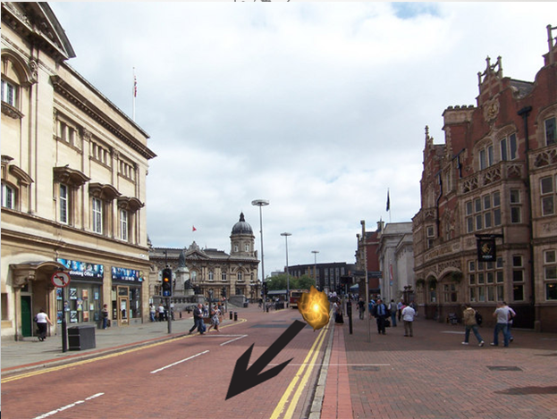
Dave developed Tom’s idea by adding the ball light into it. Basically, he designed ball light in Adobe After Effect CS6 and that light would flight across to city and shoot up to clouds and explode to text ‘Hull City of Culture 2017’.

Process of creating the ball light

The ball light was created from all these elements below

1.

ball

2.

ball2

3.

ball3

The final result

finished ball light finished ball light2

Creating glass effect

This task was Tom’s, he created title in Adobe Photoshop CS6. He created cloud effect with the orange colour, using colour dodge.
glass effect

Then he created title ‘CULTURE’ with a lot of different effects such as inner shadow, outer glow gradient overlay. All these effects combine to create this glassy look.

text

Visualizing the final product

When the title was done, he added outline of the city to the bottom. It was the same one that we used for poster.

final ad

Visualizing the video

Once all the elements needed for the advert were created, Dave did visualization of it.

1.

video


2.

video2


3.

video3

4.

video4


5.

video5


Setting tasks

Because we worked as a group, we set ourselves different areas that needed to be researched. My task was to research what kind of music is used for laser shows and mapping.

I typed into Google ‘music for laser shows’ and it came up with a lot of different websites. I found out that usually, upbeat music is used for this type of show. Then I went to YouTube and had a look at videos. Two of them were very good and proved that upbeat music is usually used.

First one – click here to view

Second one is more about filming music which creates emotions and sometimes it is used for this type of show. [click here to view] After all research I’ve done, I came to conclusion that it is best to use upbeat music rather than filming music because it would be more appropriate for putting people to the good mood.

That is why I found two different samples of music that could be used for our project.

Explanation of the task

The task is called Design for Advertising. We had to split into groups and choose between two options – 1. Hull City of Culture 2017 and 2.Siemens.

Our group consisted of me, Tom, Dave and Nicky. The reason for it was that we are already working together on another group project and we are very good team. We decided to choose Hull City of Culture.

Nicky came with an idea straight away what we could do for this task. She suggested creating a laser show that would present Hull to people coming to city. We all thought it was a very good idea and that is why we started to develop it.

First of all, we needed to think of the message that we want to present by it. Lasers consist of lights and they could have healing effect on people that is why Nicky came up with idea to link it to chakra. After consultation, we decided that word chakra could have opposite effect on people as it was planned because it is more spiritual think. That is why we left it only for colours. Nicky did big research about colour therapy and you can find all her research on her blog [to view click here].


Evaluation

Overall, I am very happy how my brochure turned up to be at the end. It looks better than I expected it to look. I also got a nice feedback from people when I did my user testing.

As I mentioned in my previous post, I had a little problem with making screen shots rounded but I am going to sort it out in very near future.

Adobe InDesign CS6 – design process

I set up the file to 210x210mm and started to put brochure together. I also worked with Adobe Illustrator CS6. I created ‘Clipping mask’ and copied full page into InDesign and then added text that I needed. I came across to a few problems but I solved them after a while.

However, the biggest problem I cannot solve is making screenshots of the website as a circles instead of having it square so it fits into the design. I tried to do it in Photoshop, Illustrator, InDesign but nothing was seem to be working.

Working screen while designing CV pages

Untitled

Explanation of the design

After consultation I really started to see what my design was missing. It was lack of graphic elements in it. In my previous assignment, I created creative part of my brand identity and it consisted of circles/lines and because I want to keep continuity in my work, I decided to do use these elements again and I think it was a very good choice at the end.

First of all, I didn’t want to repeat the same mistake that I was talking about in my previous post so I made a little plan of my brochure (with a help of my lecturer).

1782472_10201548499266506_2023221496_o

Then I opened Adobe Illustrator CS6, set file format to 210x210mm and started to design.

The result – Front cover

my-idea

Explanation of the design

As you can see on the picture above, I kept it simple, I used my logo that was designed in semester 1, and arrows to lead eyes of readers where I want them to (my logo). There is very good understanding of visual hierarchy in this design and also understanding of negative space as I designed it with that on my mind and left macro negative space in it. It is very easy to orientate on the page and find what you need to know.

2nd and 3rd page of brochure

This slideshow requires JavaScript.

Second page of my brochure is keeping simplicity but at the same time it is giving exact message to readers that I want.
Text ‘welcome to my world…’ with arrows leading eyes of readers to next page where there is only one word saying ‘WEB’ has a connotation of ‘this is my world, this is what I do, this is what I am good at and you’re about to enter it and get to know me a little bit better by reading this brochure’. I used exactly the same font and colour for ‘welcome to my world…’ that I used for my logo and also I used lowercase because I used it in my logo. Word ‘WEB’ is in the same font but different colour and it is because I tried to create connotation of icons on websites.
Also, text ‘welcome to my world…’ has lines around it and it is because I wanted to create an effect of navigation on websites.

4th and 5th page of brochure

This slideshow requires JavaScript.

I decided to use text with lines around it as my header for every section in my brochure. I kept text in bubbles what added continuity to my work as I did the same thing with back of my letter head and also CD case (assignment from semester 1). Arrows were used create a hierarchy and tell readers what to read first and where to move on to. I’m going to add a ‘motto’ that tells more about me and my personality as more and more people these days like to have ‘some kind of feeling’ that they get to know you and ‘have some kind of friendship with you’.
5th page consists of words that are relevant to what I do and they give idea to readers what my work is about. I used exactly the same words for my CD case (continuity again). Bubbles on top of the page are there to create a symmetry between two pages as they are used in page 4 just in different position. Arrows on the bottom of the page are there to lead eyes to text but I think I will get rid of them as I think it is too much of things going on on that page.

6th and 7th page of brochure

This slideshow requires JavaScript.

Here is where my portfolio starts. I try to keep it simple and straight to the point. 6th page will be all about image of the website and next page will explain what it is about and you’ll be able to see images of sub-pages of website.
I will do the same layout for 3 different modules and then I’ll move to CV page where I will keep the layout as on 4th page.

Back cover

Last-page

Back cover of the brochure has the same layout and design as front cover with a little difference – contact details and arrows are pushed a little bit down and it is because it has connotation of footer,it ends the file. Contact details are used from my business card (continuity).

When all my design in Illustrator was done and I knew exactly what and how I’m going to do it, it was time to open Adobe InDesign CS6 as this program is perfect for designing brochures, magazines etc. and start to work from beginning. Read more about it in my next post.