Student Web Awards

Untitled

Student Web Awards is an online competition for undergraduate and graduate students. Judges are leading design practitioners and educators. Submitted work is evaluated visually and interactively.

These are judging categories: 

  • TYPOGRAPHY
  • VISUAL DESIGN
  • INTERACTIVITY
  • USER EXPERIENCE
  • PEOPLE’S CHOICE
  • BEST IN SHOW

Winners for year 2015

This is the website called Pacific Crest Trail by Nathan Holter that won 3rd place in category Visual Design.
Untitled

This is the best website from all the winners in my opinion. Interactivity is great and it follows all design trends 2015. It is well worth having a look at it.


The Webby Awards

Untitled

The Webby Awards is international award for best websites in certain categories. It has been going for 20 years now. There are two honors in every category – The Webby Award and The Webby People’s Voice Award. Judges are members of  International Academy of Digital Arts and Sciences (IADAS); but also for The Webby People’s Voice is voted by public all around the world.

Entry requirements 

Untitled

There are five main categories in which users can enter the competition – Websites, Advertising & Media, Online Film & Video, Mobile Sites & Apps, Social.

Judging Criteria for Websites

The judging criteria for websites are:

The same judging criteria applies to this project and that is why it is important to have a look at it.

Web design trends on Pinterest

Next step was to have a look at web design trends on Pinterest as it is valuable source for ideas.

These are designs that caught the eye because they had aspects of web design trends that were researched earlier and parts of them could be potentially used for design of social online community.

  1. Colour scheme nicely fits together and it almost creates calm and safe feel. Use of images is great and fits with colour scheme. Also division of sections is clearly displayed by using images and colour.

4d09f63c913e98a7d1933e6c719080df


2. Nice, elegant, modern style and feel of the site. Top navigation bar is great feature of this website, it offers easy orientation on the site for users. Ability to choose different languages, search bar, log in to account is on top of the website and clearly visual to users. It uses iconography rather than text which is important for user experience on different devices.

Social media icons are on the left side of hero image and they are easy noticeable.  This website is using card design.

b514e5117b8cc6877b32f46cf6a2bf4d


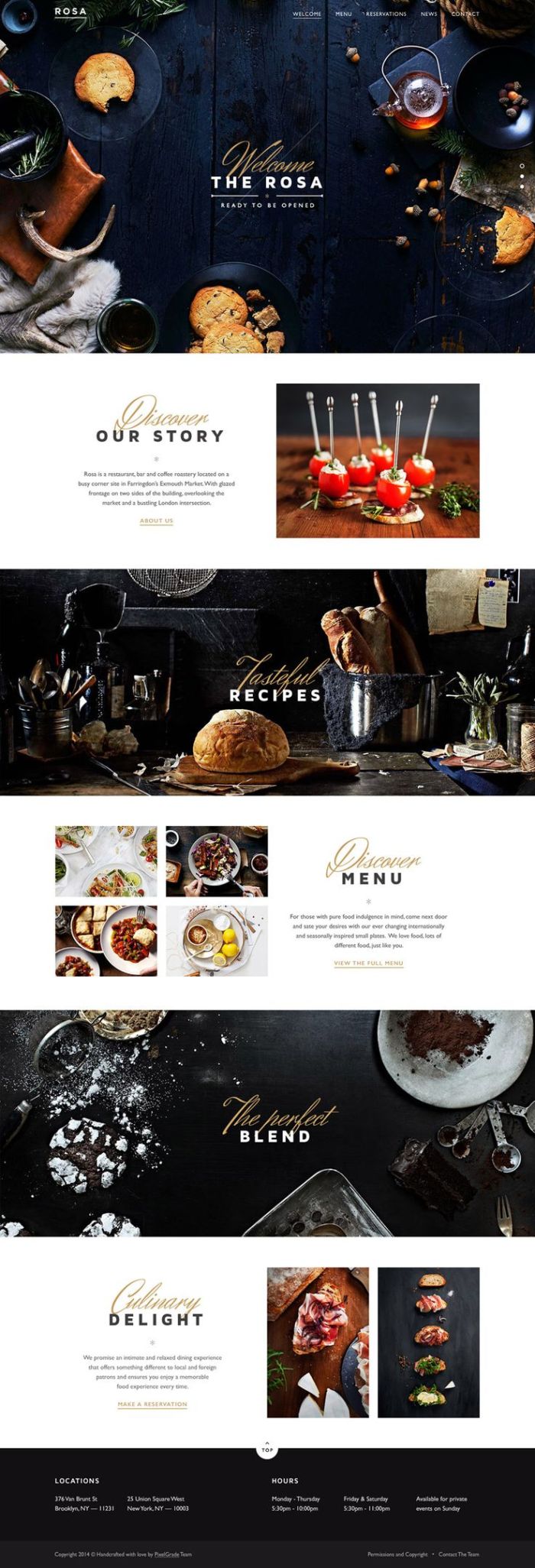
3. This design has nice and simple splash page with clear elegant font. It is scroll down page that tells story to use why they are different and why they should come to them. This is what needs to be created for splash page for social online community.

d370f69f5cd7bbe0c6738625fc24e94a


4. This design is very visual and follows design trends in every step. Account information is nicely displayed on the left side; time line monitoring user activity is clever way to create better user experience. Right side is dedicated to images that are turned into slideshow. All that is separated with navigation for easier orientation on the site.

This design is going to be used for dashboard for logged in users.

d6c94a86df0bea85a26572dd2ed00449

(All images were downloaded form Pinterest)


Web design trends for 2015 – 2016

Being up to date with design trends is highly important in order to produce good quality web design not only visually but also produce good user experience. This is the reason why research about web design trends for this year and following year has been done.

Patterns that are ‘in’ and will not go away any time soon

  1. The hamburger menu
    Screen Shot 2015-11-13 at 12.55.59
  2. Split screen design
    motion_emotion
  3. Card Design
    7014f0c9a99c83182a2c17d77d24c14b
  4. Hero Image
    Screen Shot 2015-11-13 at 12.59.39
  5. Responsive Design
  6. Flat Design – consists of vibrant colour scheme, simple typography, minimalism
  7. Material Design
  8. Block grids
    trainers
  9. Account registration – easier registrations consisted by choosing information rather than typing
  10. Long scrolling
  11. Rich Animations – they are not supposed to be used all the time and in a big amount but use such as loading bar is appropriate
  12. Hover Animations
  13. Background video/animations

(Research was done at http://www.awwwards.com/6-web-design-trends-you-must-know-for-2015-2016.html 
http://www.creativebloq.com/web-design/layout-trends-2015-so-far-71515699 )

(Images were downloaded from http://www.awwwards.com/6-web-design-trends-you-must-know-for-2015-2016.html 
http://www.creativebloq.com/web-design/layout-trends-2015-so-far-71515699
http://webbyawards.com/)

Target audience

The Animal Welfare Act 2006

“The Animal Welfare Act 2006, which came into full effect a year later, was the first review of pet law in 94 years – replacing the Protection of Animals Act, passed back in 1911 – and combined over 20 individual rules and laws into one single piece of legislation.”

“The act also changed the minimum age for buying or winning a pet to 16 – though children younger than this can, of course, still legally own a pet.”

(Quoted from http://www.keepingexoticpets.co.uk/rules-regulations-keeping-exotic-pets.html
7)

Therefore, target audience are people of age 16 – 99.

The research showed that households with kids under 5 years old should avoid keeping reptiles because of possibility to catch salmonella as child’s immune system is still developing at that age. Salmonella is bacteria that might be carried on body of any reptile and that is why it is important to wash hands straight after touching reptile and regularly clean its vivarium.

It depends on parents when they decide it is the right time to but a reptile as a pet for their kids and therefore minimum age to own a reptile cannot be really defined.

(Research done at 
http://www.reptileexpert.co.uk/reptile-keeping-law-faqs.html
8

http://www.cdc.gov/features/salmonellafrogturtle/
9

http://www.hartz.com/Reptiles/Getting_Started/keeping_children_safe_around_reptiles.aspx
10)

Branding

This is the branding –

branding

It is simple and straight forward to fit the style of the full website.

Name for this website is Vivarium because of the symbology to reptiles housing. Vivarium is name for housing of reptiles and because this social community wants to create feeling of all reptiles being home at this place.

First letter of the title is orange to create better contrast with rest of the letters and also black background. This branding has been designed in Adobe Photoshop CS6.

Mood Board

To create mood board for this project, Niice mood board tool was used to create interactive and modern mood board. It is important to produce good quality mood board to show client what kind of feelings you want to achieve in users when using the website.

What is Niice and how it works?

Niice mood board tool works on base of card design which is one of the trends of 2015 – 2016.

Untitled2

It uses similar technique of Pinterest where user type searching word into search box and images comes up. It is supported by all sizes of screens and can be used on all devices which is its big advantage.

Untitled

After finding the right image, user can add it into project and later on customise – resize images, move them, delete them, add more image, add colour effect on images, add videos, upload images from own files etc.

Saving as jpg or different formats is available after paying for premium option. However, sharing mood board with link is available for free option.

Here is the image of the mood board:
Mood board

There aresix images that were chosen carefully to express what kind of feelings this website wants to evoke in users. Starting from left side:

  1. The first image represents informative feeling of the website.
  2. Second image represents website being up to date with designing trends to give the best user experience and also to be able to compete with competitors already out there.
  3. Third one represents website being family orientated with pets in mind.
  4. Fourth image represents friendly environment.
  5. Fifth image represents modernistic feel with nature feature.
  6. Sixth image represents feel of ‘pets first’ approach on the website.

Here is the link to the mood board for this project: https://niice.co/m/cd37a25786d30d430ecad1b818ad6d04

Style approach


Niice mood board tool was used to create this style approach.
There are five images in style approach.
Let’s start from top left corner:Style approach

  1. The first image represents modern/trendy/up to date design that is important to keep in mind when designing. This is because one of the purposes of the website is to give unique user experience and also the website needs to stands out from competitors.
  2. The image below represents uniqueness that needs to be on the website in order to give users the best user experience possible and also to make them come back.
  3. Third image represents user friendly design and also pets are on first place on the website.
  4. Fourth image represents having fun on the site.
  5. Fifth image represents ability to use the site on all devices and thus give users ability of using it on the move.

Here is the link to the style apporach on Niice: https://niice.co/m/463def9f8648bcf529f5aefb901aea92